
Dyslexia affects one in every 10 people worldwide. Within the United States alone, 17% – 20% of the population is dyslexic, a specific kind of reading difficulty that is caused by genetic neurological variations. Often and without knowing, dyslexia makes people switch and transform letters and words as they read.
The bigger problem, however, lies in the fact that traditional fonts and the structure of the English language only worsen this issue. For example, traditional typefaces base some letter designs on others, creating what researchers like to call “twin letters.” A common example of this unfortunate system is the letters “b” and “d.”
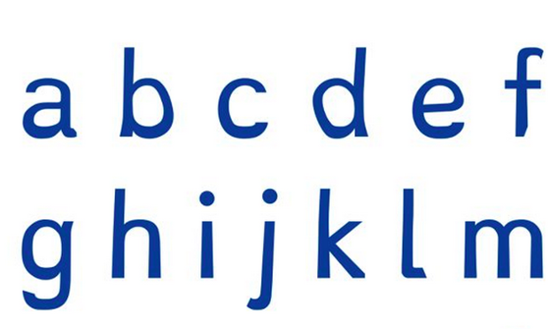
A Dutch designer, Christian Boer, has created a new font to help dyslexics navigate text. This font, Dyslexie, has letters that are designed in a way in order to avoid confusion. The font uses a default dark blue, which according to researchers, is more pleasant for dyslexic readers. Boer’s unique font also uses letters that have a heavier bottom half, creating distinction among the individual letters. Boer has also made openings and space between letters larger and has tilted some letters that closely resemble others.
Dyslexie is functional with both Apple and Microsoft and is free for home users.
Simple solutions like this one are necessary for increasing the educational potential for those afflicted with this growing disability.
Written by Varun Vallabhaneni’16